incredibox sprunki 2025
Incredibox Sprunki 2025: A Glitchy, Hopeful Mess From The Future
Okay, let's be real. "2025" in a mod title usually means someone changed the colors to neon and added one (1) new wub sound. But you click anyway, because hope is a stubborn thing. And sometimes... sometimes it's not *totally* wrong.
First impressions matter, right? My browser's autofill now suggests "sprunki" before my actual email address. That's the level we're at. So when I loaded Incredibox Sprunki 2025, I was ready for anything. Or nothing. Mostly nothing.
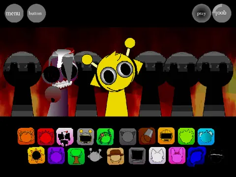
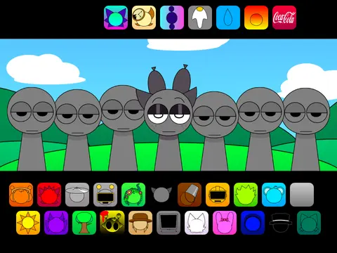
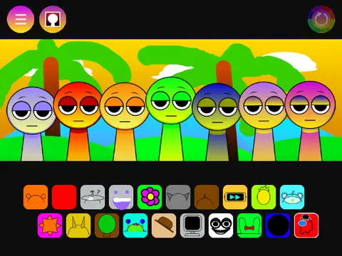
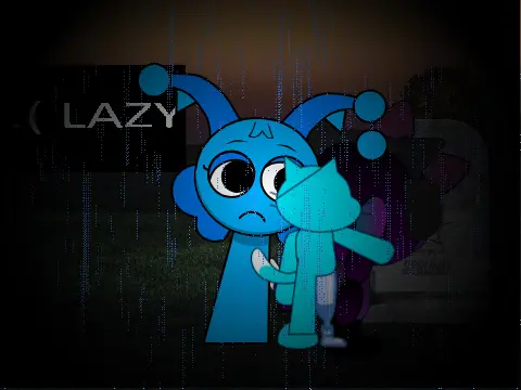
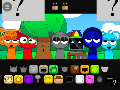
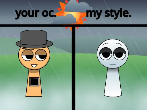
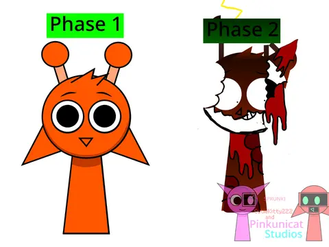
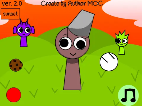
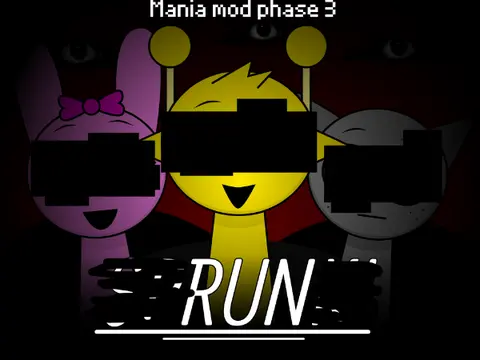
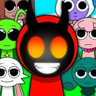
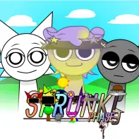
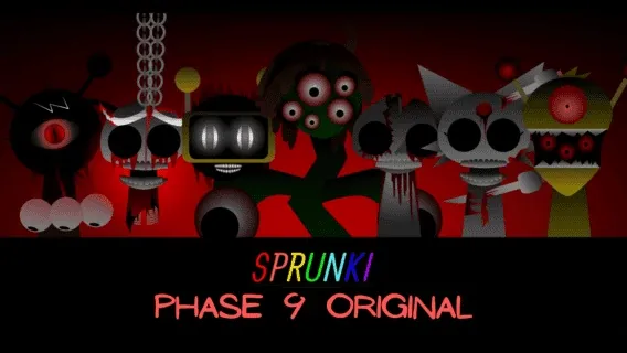
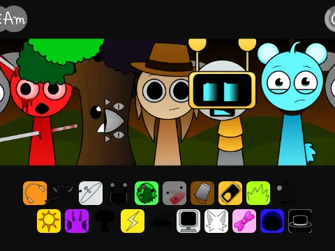
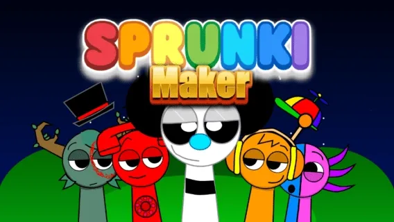
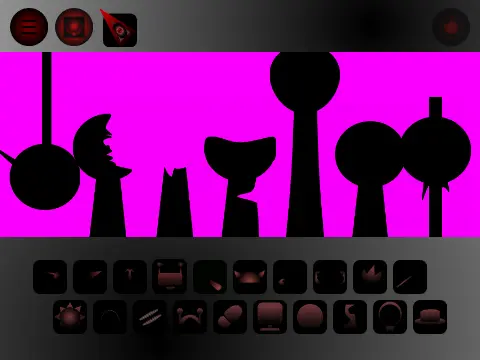
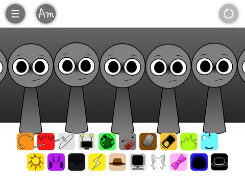
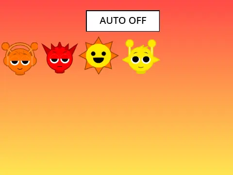
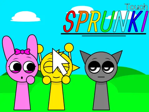
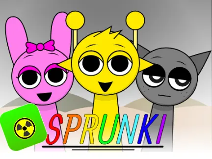
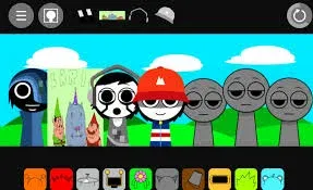
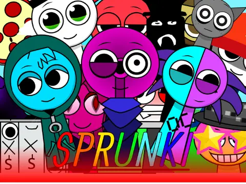
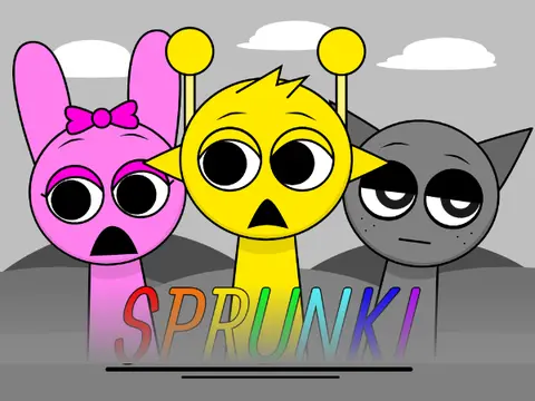
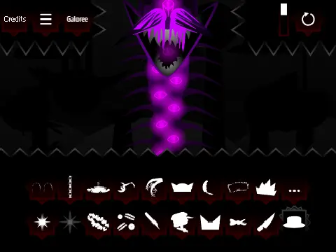
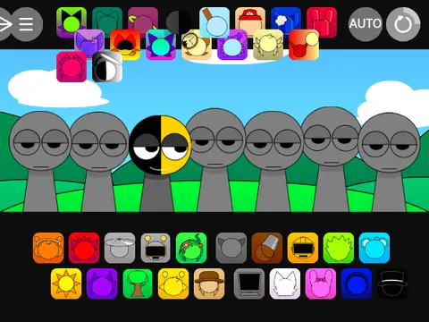
The visuals hit you first. It's got that "trying to be futuristic" vibe, which often translates to "lots of blue and purple gradients." The character designs are... ambitious. Some look like they escaped from a cyberpunk game, others look like the usual blobs but with extra shine. The character designs look like they were made in MS Paint in 2005. In a good way. That nails it. It's charmingly janky. You can tell someone spent time on this, even if that time was at 3 AM fueled by caffeine and questionable life choices.
Now, the sounds. Ah, the heart of any Sprunki. This is where the "2025" promise gets tested. Are there new bleeps? New bloops? The answer is a tentative yes. There's a bass that feels deeper, a few high-pitched tones that sound almost... crystalline? But then you get the classic sounds too, the ones that feel like home. There's a specific sound that exists in every Sprunki mod. The "blip" sound. It's here too. Thank god. You can't have a future without remembering your roots, even if your roots sound like a malfunctioning robot.
I tried to make something coherent. I failed, obviously. But the failure felt different. The way sounds layered had a slightly different texture. Maybe it's better audio mixing? Or maybe my ears were just tired. I've played so many mods that the original now sounds "wrong" to me. That's the real effect of diving deep into this community. Your baseline for "normal Sprunki sound" shifts until you're judging futuristic mods at 2 AM.
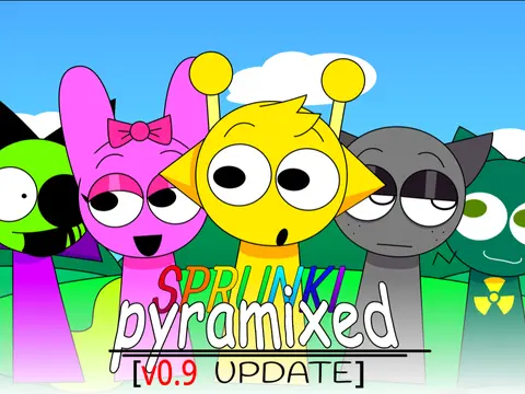
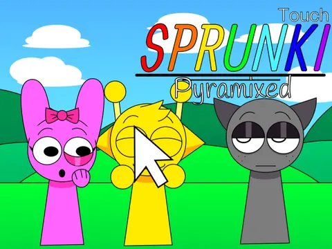
How does it stack up against the giants? Well, it's no Pyramixed 0.9 in terms of polish or scope. That thing is a beast. But 2025 has its own personality. It feels less like a definitive edition and more like a "what if?" sketch. And there's value in that. The community thrives on these experiments. Someone probably shipped two characters. Of course they did. You just know someone out there is writing fanfic about the new blue character and the old orange one meeting in this timeline.
Playing it gives you a weird feeling. This feels like the soundtrack to a rainy day in a cyberpunk city. It's got that melancholic yet electronic vibe. Not really for making bangers, but perfect for just... zoning out. Watching the new animations loop. Letting the slightly-offbeat rhythm just wash over you. Is it the future of Sprunki? Probably not. But it's *a* future, and it's interesting to visit.
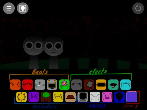
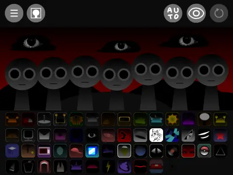
Technically, it holds up. Mostly. The drag-and-drop feels slightly off in this one. Like 2 pixels to the left. Yeah, that tracks. Future tech, same old slightly-broken feeling. It's part of the charm, I swear.
So, who is Incredibox Sprunki 2025 for? It's for the curious. For the people who have clicked through every Phase and want a taste of something that tries to be new. It's for when you're bored of the classics and want to see what a fan's dream of tomorrow sounds like today. It's messy, uneven, and full of heart. And honestly, that's most of the best stuff in this weird, wonderful corner of the internet.
Just don't expect a revolution. Expect a glitchy, hopeful peek through a cracked window into what might be. And sometimes, that's enough. My foot was tapping by the end, and I didn't even notice. That counts for something.